# data comes from NY Times GitHub Repository - ends March 2023
# not evaluating this code chunk because we will clean the data and use the clean data set
cases <- read_csv("https://raw.githubusercontent.com/nytimes/covid-19-data/master/us-states.csv")PA 10: COVID-19 Infections and California
This task is complex. It requires many different types of abilities. Everyone will be good at some of these abilities but nobody will be good at all of them. In order to solve this puzzle, you will need to use the skills of each member of your group.
Groupwork Protocols
During the Practice Activity, you and your partner will alternate between two roles—Computer and Coder.
When you are the Computer, you will type into the Quarto document in RStudio. However, you do not type your own ideas. Instead, you type what the Coder tells you to type. You are permitted to ask the Coder clarifying questions, and, if both of you have a question, you are permitted to ask the professor. You are expected to run the code provided by the Coder and, if necessary, to work with the Coder to debug the code. Once the code runs, you are expected to collaborate with the Coder to write code comments that describe the actions taken by your code.
When you are the Coder, you are responsible for reading the instructions / prompts and directing the Computer what to type in the Quarto document. You are responsible for managing the resources your group has available to you (e.g., cheatsheet, textbook). If necessary, you should work with the Computer to debug the code you specified. Once the code runs, you are expected to collaborate with the Computer to write code comments that describe the actions taken by your code.
Here are more details of the Pair Programming Protocols
Note
The partner had the most relaxing spring break plans (this is of course relative) will start as the Computer (typing and listening to instructions from the Coder).
Group Norms
Remember, your group is expected to adhere to the following norms:
- Be curious. Don’t correct.
- Be open minded.
- Ask questions rather than contribute.
- Respect each other.
- Allow each teammate to contribute to the activity through their role.
- Do not divide the work.
- No cross talk with other groups.
- Communicate with each other!
Goals for the Activity
- Use the
dplyrverbs to transform your data
- Use other
tidyversefunctions to prepare and plot the data
- Use
lubridateto deal with dates andstringrwith text.
THROUGHOUT THE Activity be sure to follow the Style Guide by doing the following:
- load the appropriate packages at the beginning of the Quarto document
- use proper spacing
- add labels to all code chunks
- comment at least once in each code chunk to describe why you made your coding decisions
- add appropriate labels to all graphic axes
Setting up your Project
Your project should have the following components:
- completed pa-10-covid-time-activity.qmd
- rendered file as
.html datasub-folder that contains- created data
- created data
- png file of created graph for CA 2021 and for your own research question
Important
The original Computer should submit the zip file for the canvas quiz. The original Coder can just submit the rendered html file.
Computer - Be sure to share the final .qmd, .png, and .html file with the original Coder.
Data Description - United States COVID-19 Cases and Deaths
Starting in January 2020, the New York Times started reporting on COVID-19 infections in the United States and eventually created a Githhub Repository of the data they used and reported on in their stories (a field called “Data Journalism”). They ended their data collection in March 2023 and switched to just using data from national reporting systems.
We will use their data to evaluate COVID-19 and how it varied across different states. Here are the NY Times data on cumulative cases by date and states (including territories).
Note that both cases and deaths are cumulative by date and we will want to observe just the unique cases per day so we can get various estimates of totals across the states.
If we want to extract the daily cases we can use the following code which will calculate the difference in (cumulative) cases for one day minus the previous day using the diff() function from base R.
Warning
Your team should create a data subfolder in your project to store the created data and to upload the population data to as well.
# calculates the unique new daily cases and deaths for each state
# eval is false since we created a new data set we will use going forward
cases |>
  group_by(state) |>
  arrange(state, date) |>
  mutate(cases_daily = c(cases[1], diff(cases)),
         deaths_daily = c(deaths[1], diff(deaths))) |>
  ungroup() |>
  write_csv("data/covid-cases-us.csv")
Now that are data is in the format we need (sort of), we will start our analysis.
California COVID-19 Cases
First, we need to read in our clean data.
cases <- read_csv("data/covid-cases-us.csv", show_col_types = FALSE)California Monthly COVID-19 Cases from January 2020 - March 2023
We want to create a graph that plots the number of cases per month in California. We want the x-axis of the plot to have the month/year (e.g. Mar ’21), and the number of cases on the y-axis. The months/years should be in order chronologically.
Below is some code that can help you get started with the process of working with the data. Use the functions from lubridate to help you extract out the right information. You will also use functions learned from other packages such as dplyr. You will want a variable that gives you month and year as “Jun ’20” and a date type variable that you can use to easily reorder your month and year variable within your graph (otherwise R will default to alpha-numeric ordering).
ca_only_month <- cases |>
 # code to filter out just California  |>
  ______(date ____(date), #make sure date is treated like a year month day format
         month = ______(date, label = , abbr = ), #extract out month in abbreviated label form, e.g. Jan.
         year = ______(date), #extract out the year
         y_m = _______(date, unit = "month"), #find a function that makes all the dates appear as the first day of the month, ie the floor of the month
         yr = _________(year, pattern = "20*" ,replacement = "'")) |>  #replace the 20 in each year with a ' so it reads as '21
  ________(col = "month_year", month, yr, sep = " ") |>  #create a variable called month_year that joins the abbreviated month with the shortened year, or Apr '21
  # calculate the total cases per month, retaining both the month_year variable and the y_m variable in addition to a new total_cases calculation |>
  ungroup()
Your final data should look like this:
# A tibble: 10 × 3
month_year y_m total_cases
<chr> <date> <dbl>
1 Apr '20 2020-04-01 41887
2 Apr '21 2021-04-01 73176
3 Apr '22 2022-04-01 131982
4 Aug '20 2020-08-01 210270
5 Aug '21 2021-08-01 411696
6 Aug '22 2022-08-01 391372
7 Dec '20 2020-12-01 1070622
8 Dec '21 2021-12-01 430136
9 Dec '22 2022-12-01 323828
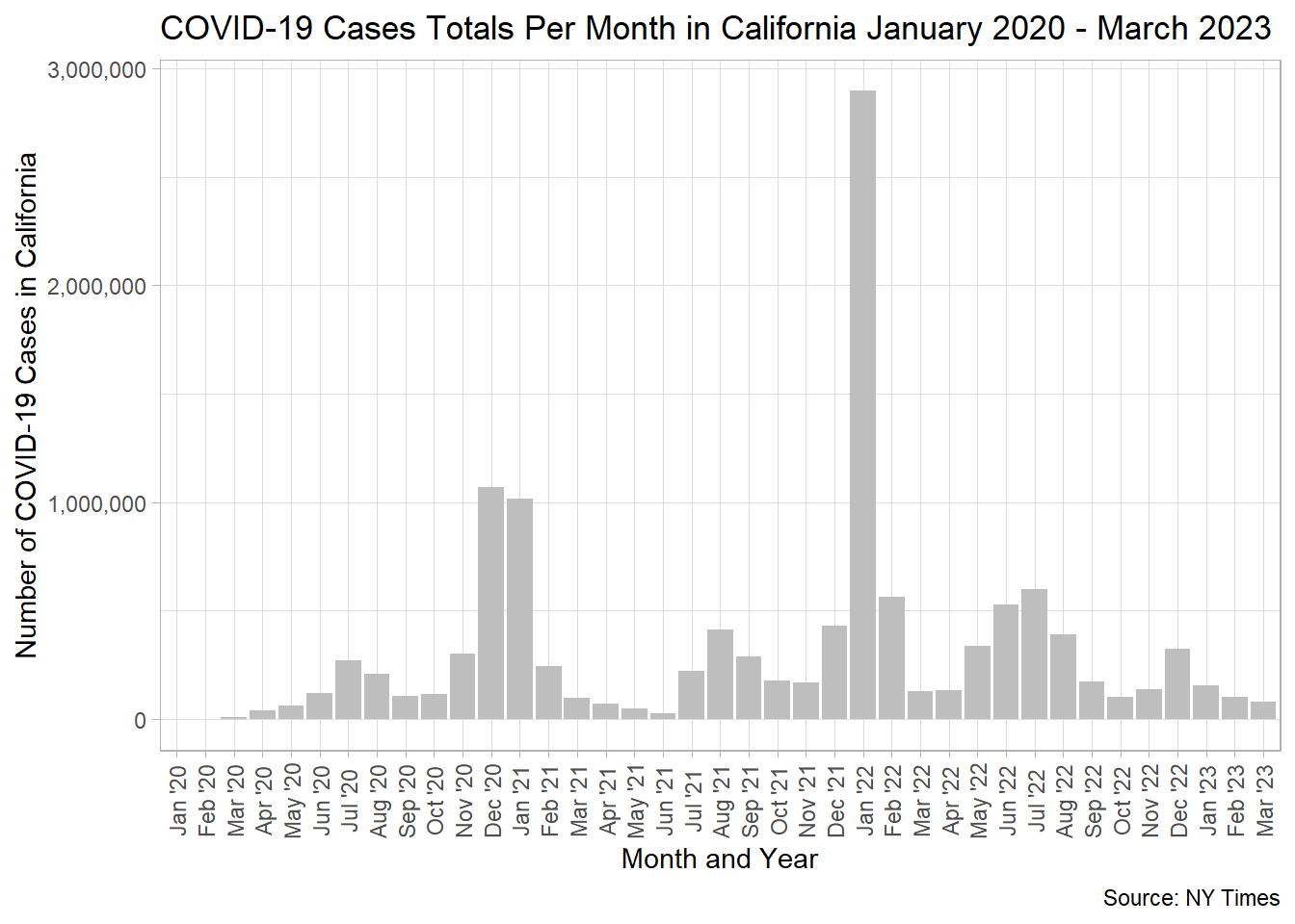
10 Feb '20 2020-02-01 25Minimal Goal Graph
At minimum, try to recreate the following graph using your data from above. Here are some useful functions to consider.
fct_reorder()to use they_mvariable which is automatically ordered by date to reordered the character variablemonth_year.
label_comma()from thescalespackage for changing your y-axis.
theme()with additional arguments foraxis.text.xto adjust your label orientation (angleandvjust).
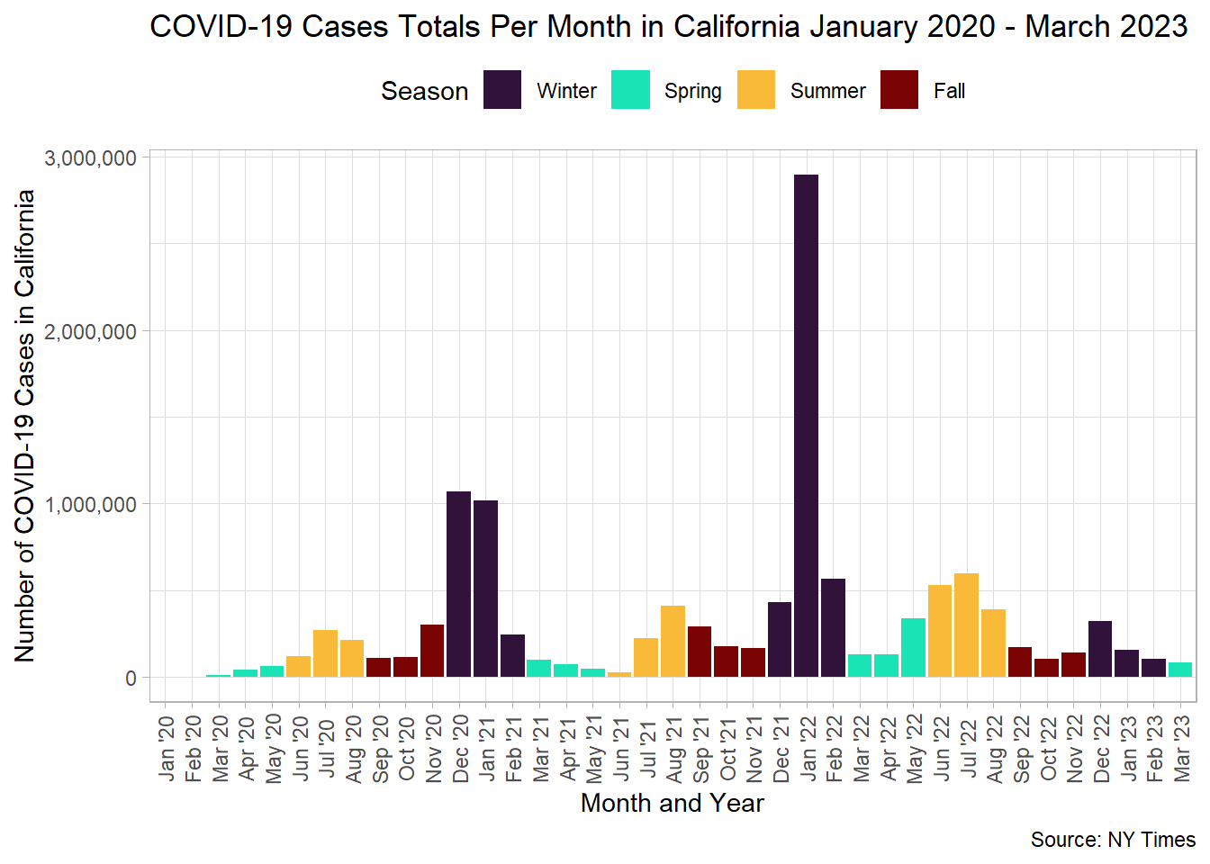
Major Goal Graph
Want a challenge? Try recreating the graph below.
Canvas Quiz Question 1
Which Month in California had the most COVID-19 cases between January 2020 and March 2023?
Canvas Quiz Question 2
Which month in 2021 had the fewest number of cases in California?
What Did California COVID-19 Cases Look Like in 2021
Create a graph that provides information about the number of cases in California in 2021 only. You can use the complete data set information originally provided, but your graph should only represent some aspect of COVID-19 in 2021.
Be sure to follow all guidelines for creating good graphics.
You will submit that graph as png file in your Canvas quiz.
Create your own graph
Using the COVID-19 data, create your graph to answer you own research question. You will submit that graph as png file in your Canvas quiz. Include your research question as the subtitle of the graph.